
 Graphs that Help You Ask Important Questions
For good… not evil
December 5, 2023
Maryfrances Porter
This weekend, I was thinking about how data can be used for good, and how data can be used for evil.
Data for Good and Evil
You all know that you do not need statistics in real life (refresher on why here). It is helpful to remind yourself how numbers work – because numbers can build trust and understanding (good) or they can obscure the truth and promote stereotypes (evil).
So, yeah, let’s use data for good and not evil!
Our Good Friend the Bar Graph
This might seem like a funny place to start, but bear with me. Bar graphs are one of the two critical graphs you have to know how to create so you can look at differences between groups of clients.
Groups might be based on demographics (e.g., gender, race/ethnicity) or aspects of programming (e.g., clients who worked with Janice compared to those who worked with Jermaine). We aren’t grouping things today though. Let’s just look at how data works in bar charts.
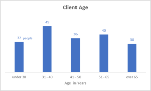
Pretend you’re on an Impact and Learning Team. How would you describe the data in the following graph?
I’m guessing you might say something like:
Most people are in the middle of adulthood (age 31-40), a few are younger, and several are older. There are about the same number of people under 30 as over 65.
Take Two
Here’s the exact same data. What would you say about this graph?
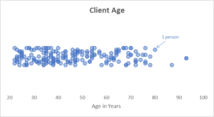
A graph where each dot is a person’s age. The graph shows how the ages are spread out.
This is called a jitter graph or a bee swarm graph – I just call it a graph that shows the way the data are spread out. (Nick has a great tutorial here – watch minutes 2:05 – 8:04; invest 4 minutes you can create one too!)
This isn’t a critical graph – but boy is it helpful!
What would you say about this graph?
Maybe you’d say something like:
Most people are under 50. There’s also a cluster of people who are between 60 and 75.
Right! That’s not so hard.
You: So What?
Great question! Thanks for asking!
What if you really wanted to see how many people of retirement age were being served? With something like age data, you could just use a bar chart and make one of your bars show people age 65 and older. But, what you might notice here in this graph is that there’s really more of a break at age 60.
You: Does that matter?
Maybe, maybe not. That depends on your programming and what you’re trying to understand.
But WHAT IF this wasn’t age data? What if this was a rating 1-100 of how confident clients say they are in implementing a business plan you just supported them in writing?
Confidence in Implementing a Business Plan
If this age data were confidence scores: The first thing to know is that the average is 46.5. The average really doesn’t tell you anything useful (which is why averages are NOT one of the three key Excel formulas you should know).
The second thing you’d want to know is why so few people rating confidence over 50?
The third thing you might want to know is what’s different about the four people with scores of at least 80?
And fourth, you might also be interested to know what’s different between people with scores under 60 and those with scores over 60?
Answering these questions is how you come to understand the data. And, understanding the data is Step 1 in moving people to action.
– Maryfrances
Your ImpactStory™ Coach
Learn more in the ImpactStory Academy!
Partnerships for Strategic Impact®
![]() At Partnerships for Strategic Impact®, I have all the tools to build out the structures and strategies you need for collecting actionable impact data; I train staff in how to use them, analyze data, and make action steps for change; I teach you to tell powerful impact stories. My goal is your sustainability: I provide just the right amount of coaching and ongoing support to ensure success.
At Partnerships for Strategic Impact®, I have all the tools to build out the structures and strategies you need for collecting actionable impact data; I train staff in how to use them, analyze data, and make action steps for change; I teach you to tell powerful impact stories. My goal is your sustainability: I provide just the right amount of coaching and ongoing support to ensure success.
This is within reach. It’s not harder than managing your budget. Plus, you, your funders, and the people you serve deserve to know more about the value your organization delivers.
If you’re reading this, then you’re already part of my network. Schedule some time on my calendar. There’s no sales pitch and no obligation. Just curiosity and answering your questions. I am the seasoned program-evaluation, program-development, data-storytelling consultants you need, right in your back pocket. I am here to bring order to the process of figuring out how to track and use your impact story.
– Maryfrances
Your ImpactStory™ Coach
Want even more?
Check out my Blogs and Videos
Check out the Resource Library
Follow me on all the places #ImpactStoryCoaching and @impactstorycoaching
![]()
![]()
![]()
![]()
![]()