Page 1 of 23
Prosperity Now Scorecard – Custom Reports
Use the tools here to download reports and graphics summarizing the data for your state or local area and the strengths and weaknesses of your state’s policies. You can create and customize data and policy reports that you can share with stakeholders or use as “leave-behinds” when meeting with policymakers. You can also create graphics that break down state policy adoption as well as data by race and over time, which can easily be inserted into reports or presentations. You can also create data tables that allow you to download the Scorecard data in table format.
Tags: Data Source, Tools and Tutorials
July 23, 2024
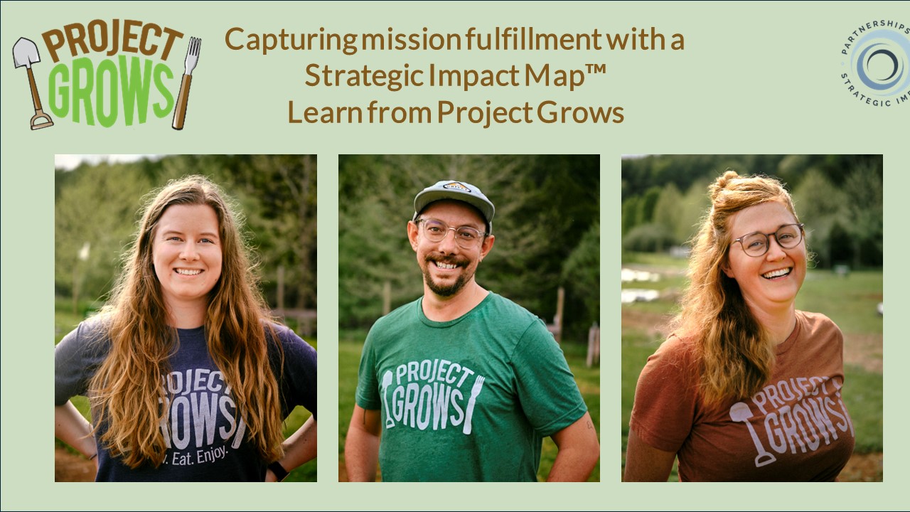
Part 3: Project GROWS Links Individual Success with a Vision for Systems Change
Project GROWS uses their Strategic Impact Map™ to plan out how they track mission fulfillment. This is a second blog about the first step of the ImpactStory™ Strategy – and how creating a Solid Framework provides the basis for telling powerful impact stories.

June 4, 2024
Part 2: Project GROWS’ Tracks Mission Fulfillment
Project GROWS uses their Strategic Impact Map™ to plan out how they track mission fulfillment. This is a second blog about the first step of the ImpactStory™ Strategy – and how creating a Solid Framework provides the basis for telling powerful impact stories.

May 6, 2024
Part 1: How Project GROWS Sets Up Their Impact Story
A Strategic Impact Map™ is an improvement on traditional logic models. While traditional logic models are focused on “inputs” (i.e., the resources nonprofits are seeking from funders), a Strategic Impact Map™ starts with what’s most important to the social sector, which is Mission. Learn about Strategic Impact Maps™ by learning about how Project Grows created theirs.
April 24, 2024
A Transformation of Program Evaluation
I have transformed traditional program evaluation into a first-of-its-kind framework and toolbox you can use day-to-day to track mission fulfillment and iteratively improve programs, separately or collaboratively together. Read about the ImpactStory™ Strategy and my upcoming book!

- Blog - Extras
- Blog - Masterful Data Viz
- Blog - Masterful impact Stories
- Blog - Powerful Data Analysis
- Blog - Programming that Works
- Blog - Smart Surveys
- Blog - Solid Framework
- Blog - Uncategorized
April 8, 2024
Are Anonymous Surveys Necessary?
Learn about different ways a survey can be anonymous, including the pros and cons of each.

March 25, 2024
How to Turn Narrative Survey Responses into Data You Can Use
I almost always recommend including open-ended questions at the end of surveys. This allows you to get some free-form, narrative responses from your clients. These narrative responses can be rich and detailed, and can give you valuable, unexpected information. But, what do you DO with them?!?

March 9, 2024
Why Benchmarking Doesn’t Work in the Social Sector
Benchmarking in the social sector is tricky because – while more productivity (i.e., serving more people) and more impact (i.e., more goodness in the world) seem like they would always be desirable – that’s not always the case! More is not necessarily better, and efficiency is often not the goal.
February 26, 2024
3 Tips for Getting AUTHENTIC Survey Responses
Nonprofit clients are often grateful, and they probably don’t want to insult you. How do you not just get a lot of “strongly agree” answers that don’t help you improve programming? Read more about three tips to help ensure they tell you the good, the bad, and the ugly!

February 11, 2024
The Trick to Defining Success in the Social Sector
In 20+ years of working with social sector partners, I’ve never met a single person who does not really, really want there to be a single number – like “profit” – that nonprofits can use as a simple, clear indicator of success.

January 22, 2024
Page 1 of 23